HIGHER LEARNING TECHNOLOGIES

Increasing first-time user engagement

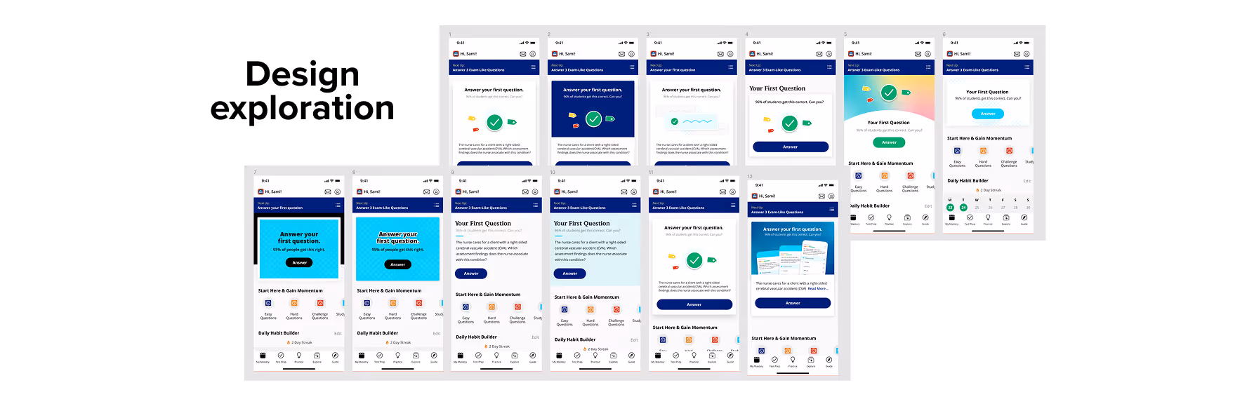
The home screens of Higher Learning Technologies' exam prep apps were packed with content — practice questions, videos, articles, and flashcards. Some apps offered more than 50 options on the first screen alone. The result was a paradox of choice that left new users unsure where to start and a significant percentage never answered their first question.

I led a product effort to increase the percentage of new users who completed their first practice question — the key action that set active users on a path toward subscription conversion. I operated as the product lead on this effort, directing the design strategy, managing the executing designer, and reporting progress to leadership.

THE PROBLEM

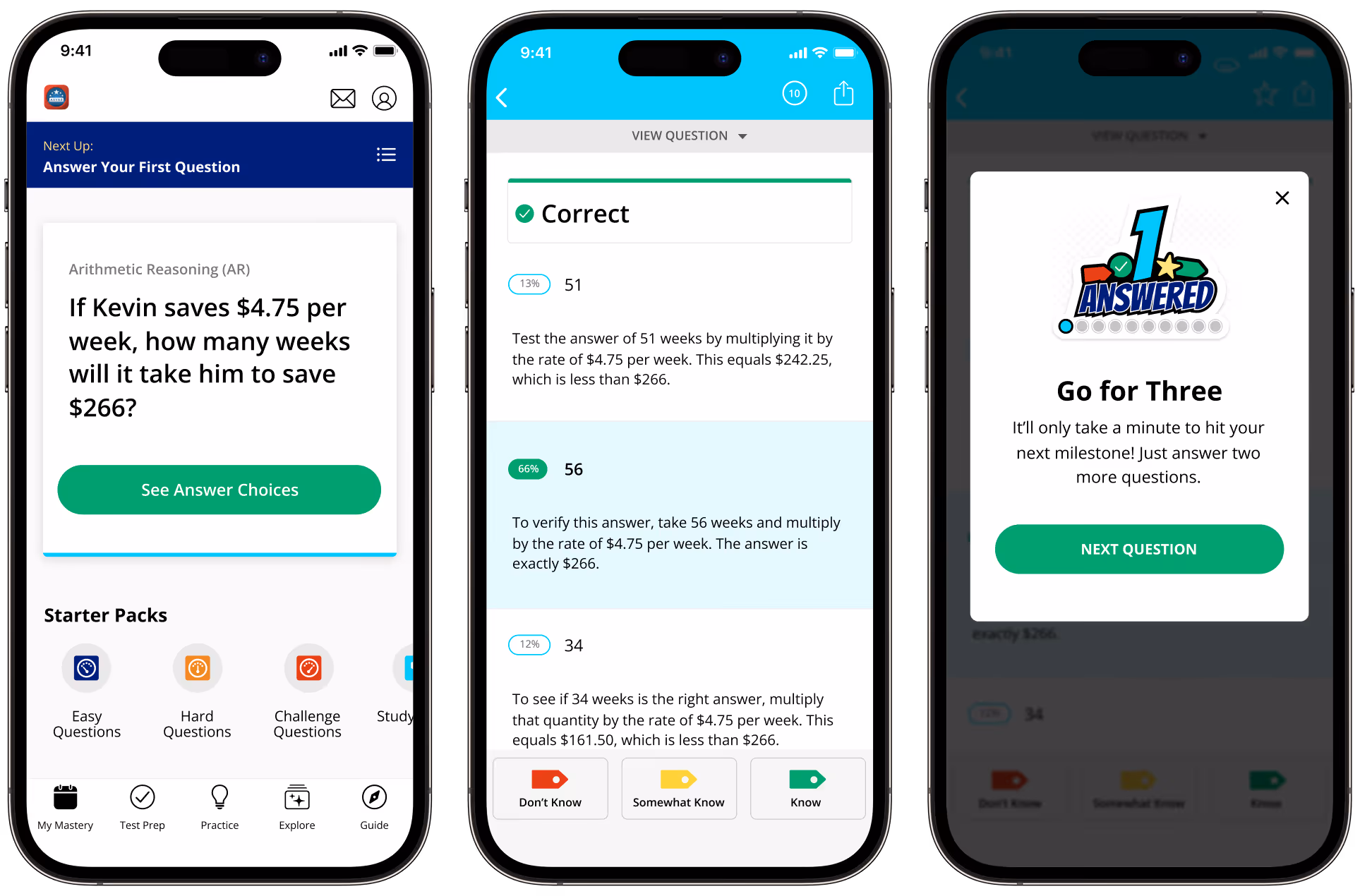
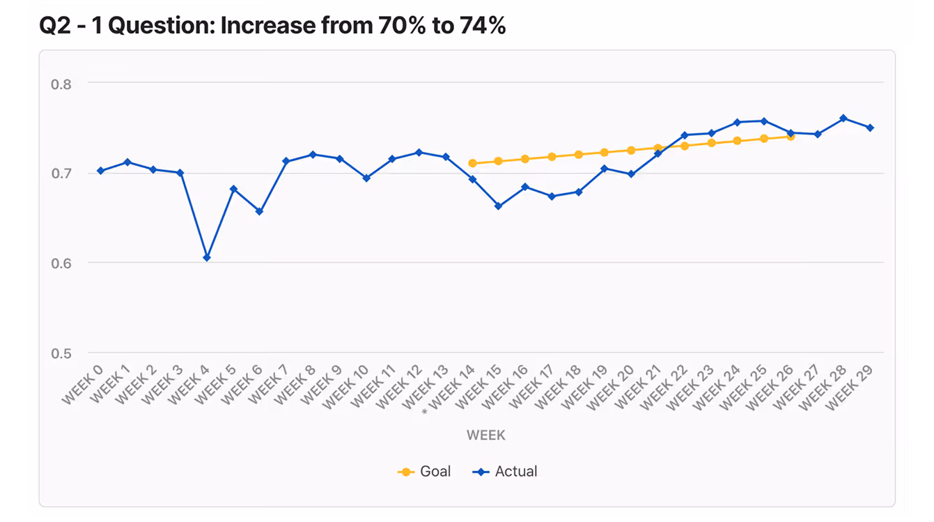
HLT’s apps were built around a clear conversion model: free users who answered 10 questions per day were more likely to subscribe for unlimited access. But users who never answered a single question couldn't reach that threshold — and first-question completion rates were averaging between 50-70% across the app portfolio.

User research clarified pain points: new users didn't know where to start and struggled to feel a sense of progress. The problem was the lack of a clear path forward. In order to increase the first-question completion rate, the user needed easy access to the question and to feel accomplished when they took action.

How might we make
answering the first question irresistibly easy?

PROCESS

LISTEN

User research and customer feedback confirmed that new users arrived motivated to study but quickly became overwhelmed by choice. The problem wasn't lack of interest — it was lack of a clear starting point.

Test

We reduced the home screen options and introduced the Start Widget, a focused entry point with a single practice question. We tested which questions to surface and found that easier questions were more likely to be answered.

Scope

We made a deliberate decision to keep the initiative small and moveable. Rather than solving every onboarding problem at once, we focused on one metric — first-question completion — and reserved larger ideas for future iterations. This allowed us to ship quickly, measure results, and build momentum for the quarters ahead.

THE SOLUTION

The Start Widget reframed the home screen experience for new users. Rather than presenting dozens of options, it offered a clear, low-friction entry point: a single practice question, surfaced immediately and easy to answer.

The design balanced two priorities: a directed path for users who didn't know where to begin, and visible access to the rest of the app for users who wanted to explore. New users were no longer left to navigate a crowded home screen alone — they were met with a simple, encouraging first step.

RESULTS

In the first quarter following launch, the average percentage of new users who answered their first question increased from 70% to 76% — exceeding the 74% goal across four apps.

But the more telling result was what happened next. With the goal met ahead of schedule, I made the case to expand the initiative — first to increase the percentage of users answering 3 questions, then 10. Each quarter would build on the last, sequencing toward the daily limit that predicted subscription conversion.

By the third quarter, the initiative had expanded beyond the original four test apps to the full portfolio — bringing a consistent, optimized first-time user experience to every exam prep app in the Higher Learning Technologies catalog.

Next case study: Finding CareGo Home